When it comes to colors, there are a lot of options. It is suggested there are at least 18 decillion (18,000,000,000,000,000,000,000000,000,000,000) colors in the world. With so many options, it can be hard to know where to start when defining a color palette. Here are some schemes that you can use to start to define the right palette for your project using the color wheel as a guide.

Monochromatic
A monochrome color palette consists of various hues and saturation of a single color. They easily create a cohesive aesthetic but are obviously limited.

A monochromatic palette with #ff00ee as a base color
Complementary
A complementary palette uses two colors from the opposite side of the color wheel.

A complementary palette with #ff00ee and #bbff00 as base colors.
Analogous
An analogous palette uses three colors that touch each other on the color wheel. Because the colors sit on the same part of the color wheel, they have a cohesive feel without the monotony of a monochromatic palette.

An analogous color palette with #ff0074, #ff00ee, and #df00ff.
Triadic
A triadic palette involves three colors at the most extreme possible points of an equilateral triangle in the color wheel.
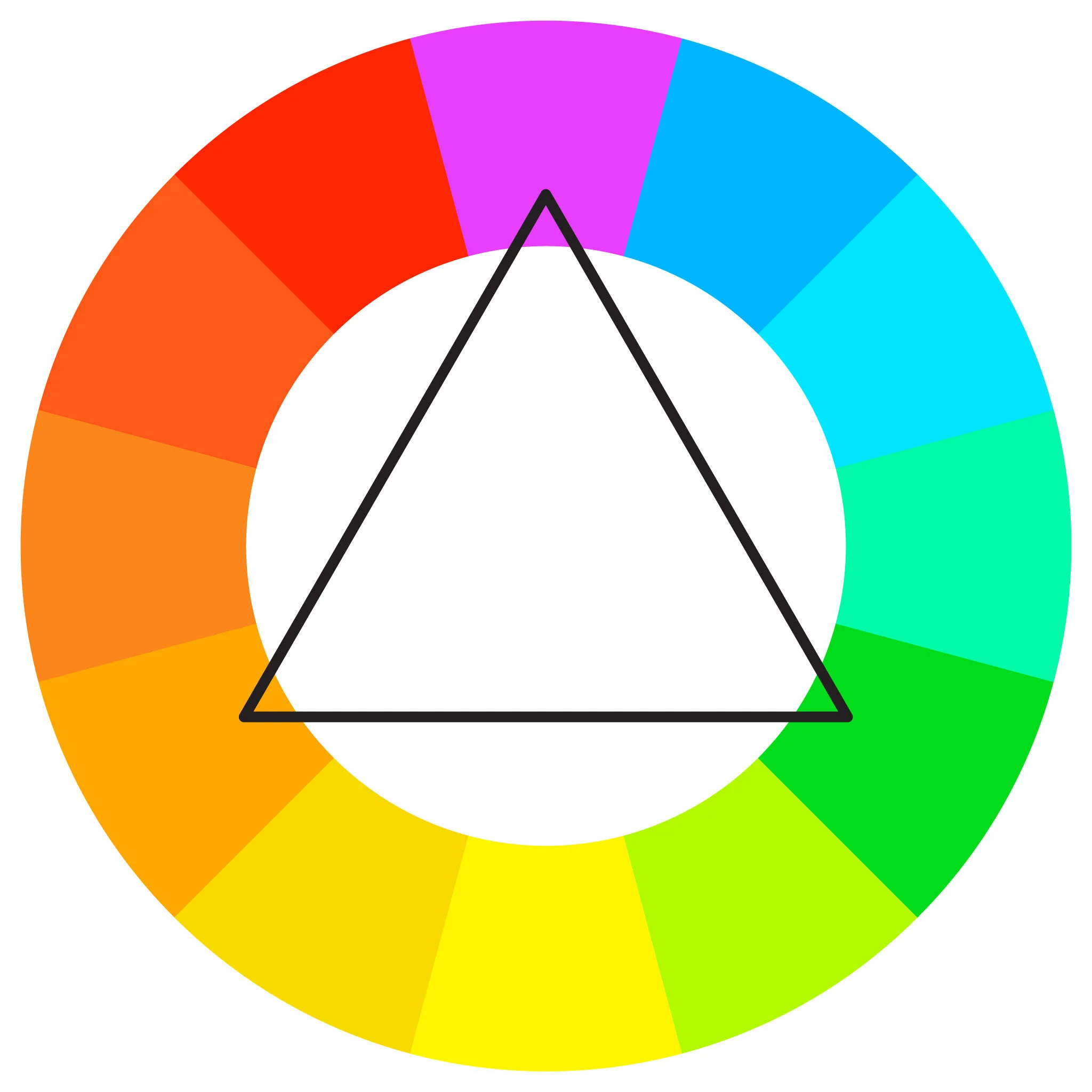
This palette has a diversity of colors while keeping a balanced feel.

Neutral + Pop Color
A neutral palette emphasizes the lack of color using de-saturated neetrals and works well with a single “pop” of color.

If you need inspiration, there are websites that can help.
And if you want to add some color to your screensaver, The : Colour : Clock displays every second as as a different color starting with black at midnight.

If you would like help with your corporate colors, reach out and tell us about your project.